Brand identity | Case study
Hunica | 2024
Stream

Overview
At Hunica, we created Stream as a showcase project to demonstrate how brand identity and UI/UX design come together in digital products.
The goal was to design a fresh, entertainment-driven brand for a streaming hub — one that feels playful, modern, and instantly recognizable across platforms.
The Challenge
In the crowded streaming space, we asked ourselves:
-
How do you make a brand stand out when every platform uses bold colors and iconic logos?
-
How do you appeal to digital-native audiences while staying versatile across touchpoints?
-
How do you create a logo and visual system that works equally well on mobile apps, social campaigns, and real-world items?


Logo Design
The Stream logo is built around the idea of broadcast waves forming the letter S.
-
The stylized “S” represents motion, connection, and energy.
-
Houschka Rounded was chosen for the wordmark, reflecting friendliness and approachability.
-
The “S” in the wordmark was custom-modified to echo the broadcast-wave “S” in the isologo, ensuring harmony across the brand.
Primary isologo
Isotype grid
Single-color and full-color adaptations.
Icon version (isotype “S”).
Color Palette
Stream’s palette is bold yet minimal:
-
Purple (#410AA6) → digital creativity, excitement.
-
Magenta (#FF2B82) → playfulness, youth.
-
Purple → Magenta gradient → signature brand energy.
-
White / Off-White (#FAFAFA) → clarity, flexibility.
Typography
-
Houschka Rounded → Logo wordmark. Rounded, friendly, modern.
-
Manrope → App UI and text system. Strong readability for digital screens.
Applications
The Stream identity extends into multiple touchpoints:
-
Mobile app interface (aligned with UI/UX case study).
-
Social media assets – templates for posts and campaigns.
-
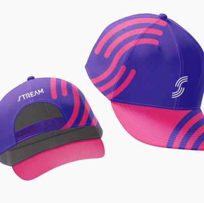
Merchandising – tumbler and cap.
-
Brandbook – a structured guide defining logo usage, color codes, typography rules, and visual system applications.
-
Exhibition stand – branded environment for events.

Conclusion
Stream demonstrates how a strong brand system supports both digital and physical experiences. By uniting logo, color, typography, and applications, we created an identity that feels playful, professional, and ready for the entertainment industry.


